
Read in Medium
Introduction
This case study examines the design improvement of the create bucket page in one of the largest cloud providers in Iran, which currently has 55 thousand of users. The goal of this study was to improve the user experience by helping users understand the bucket naming rules, reducing the number of errors, and making the process of creating a bucket easier and more intuitive.

Problem
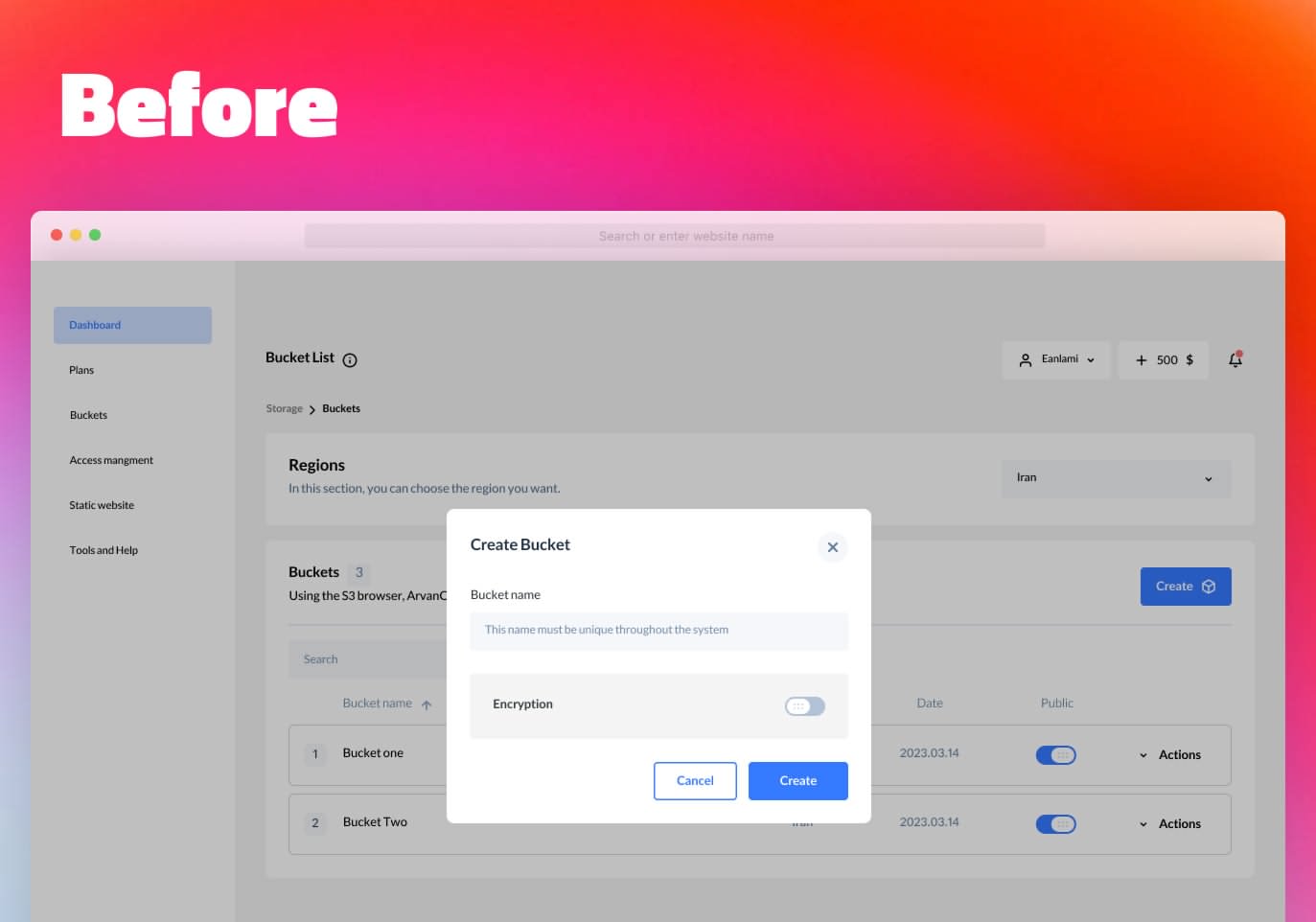
Several issues were identified with the current create bucket page:
- Users didn’t understand the bucket naming rules
- Users were not aware that the name of the bucket must be unique in the whole system
- A high number of error requests were sent to the backend
After reviewing support tickets, interviewing users, and analyzing error data, it was clear that users had difficulties in creating buckets due to unclear error messages and a lack of understanding of the bucket naming rules.
Goal
The goal of this project was to improve the create bucket page by ensuring users:
- Name their buckets according to the naming rules
- Understand the reasons for any errors that occurred
- Reduce the number of requests sent to the backend
Benchmark
To better understand the problem, the team conducted a benchmark of similar products in the field. As the closest similar products, we examined the following three products.


AWS


Azure


Cloud
Design Process
Because the change in this part of the product included side effects and the product was in the process of adding another feature called multi-site in this part. We decided to integrate the changes in the bucket creation as well as the presentation of the multi-site feature and make the changes side by side.
User flow and information architecture
In the first stage, we started to review and redesign the user flow in this section and finally integrated the changes made with the user flow in the multi-site feature. Due to the addition of several features to the bucket pop-up and planning to provide more features in this section, we first converted the corresponding window from the pop-up to a separate page and architected the content of the page according to priority and value. Finally, we designed the final wireframes according to the existing UI kit.
Solution
To address the issues identified with the create bucket page, the team implemented three main solutions:
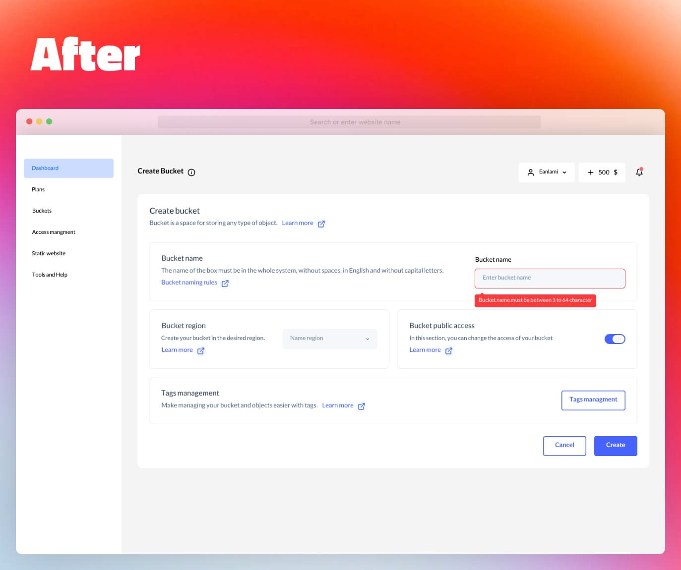
- Provide explanations in the bucket naming section
- Create restrictions in the naming field
- Place a direct link to the comprehensive document of the naming rules
Provide explanations in the bucket naming section
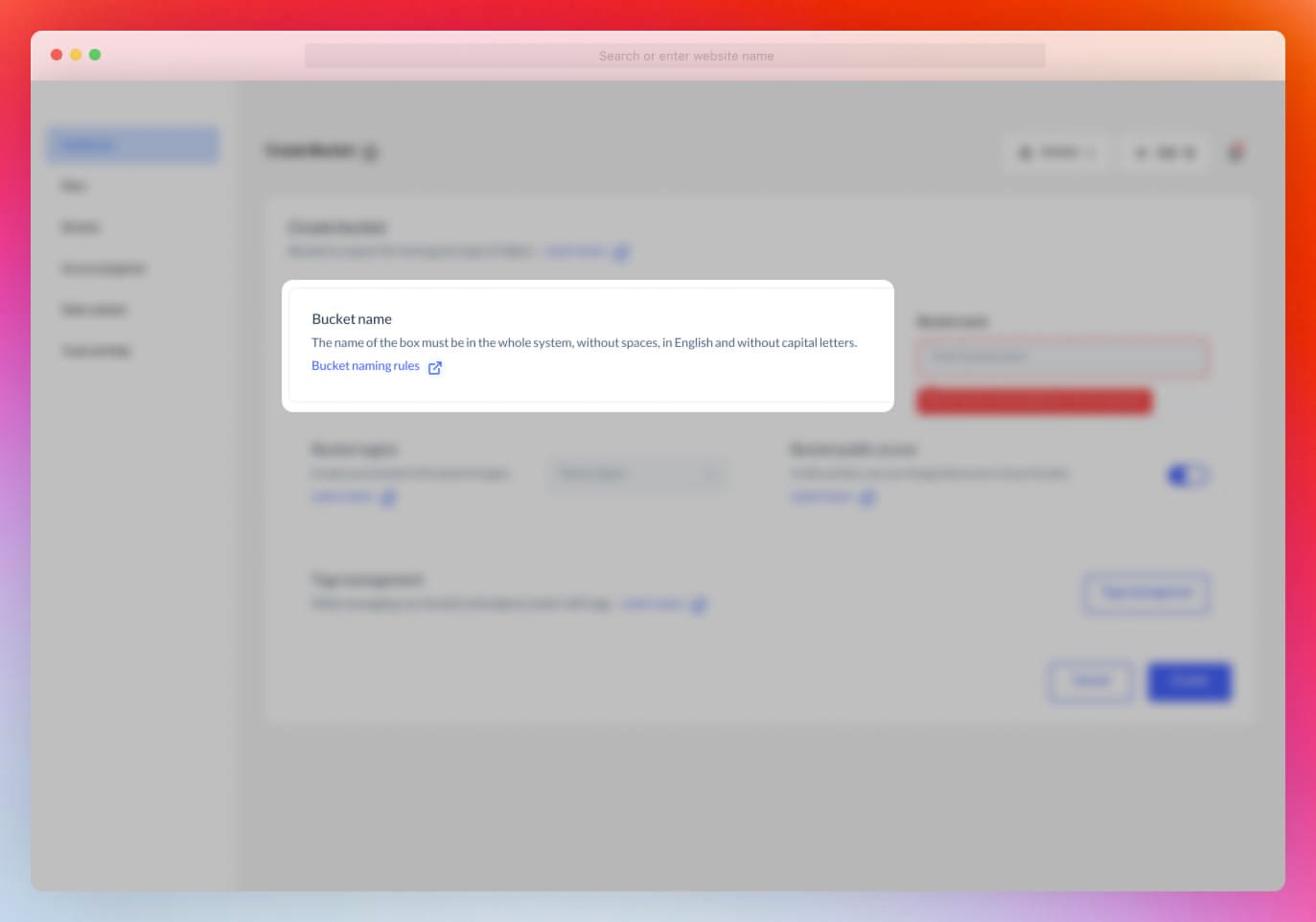
As the first and Low costs available solution, we decided to write the main items of the naming rules in a short and concise way under the naming section.

Creating restrictions in the naming field
The rules for naming the Bucket include several rules, we decided to check some rules such as being English, having more than 3 letters and less than 64 letters before clicking the create button. if the name of the Bucket is not written correctly, do not allow the user to create the Bucket by keeping the create button disabled.


As the first and Low costs available solution, we decided to write the main items of the naming rules in a short and concise way under the naming section.
As the third part of the solution, next to the text input field in the Bucket creation section, we placed a direct link to the comprehensive document of the naming rules of the Bucket, and by clicking on this link, users can be fully informed about the naming rules of the Bucket.
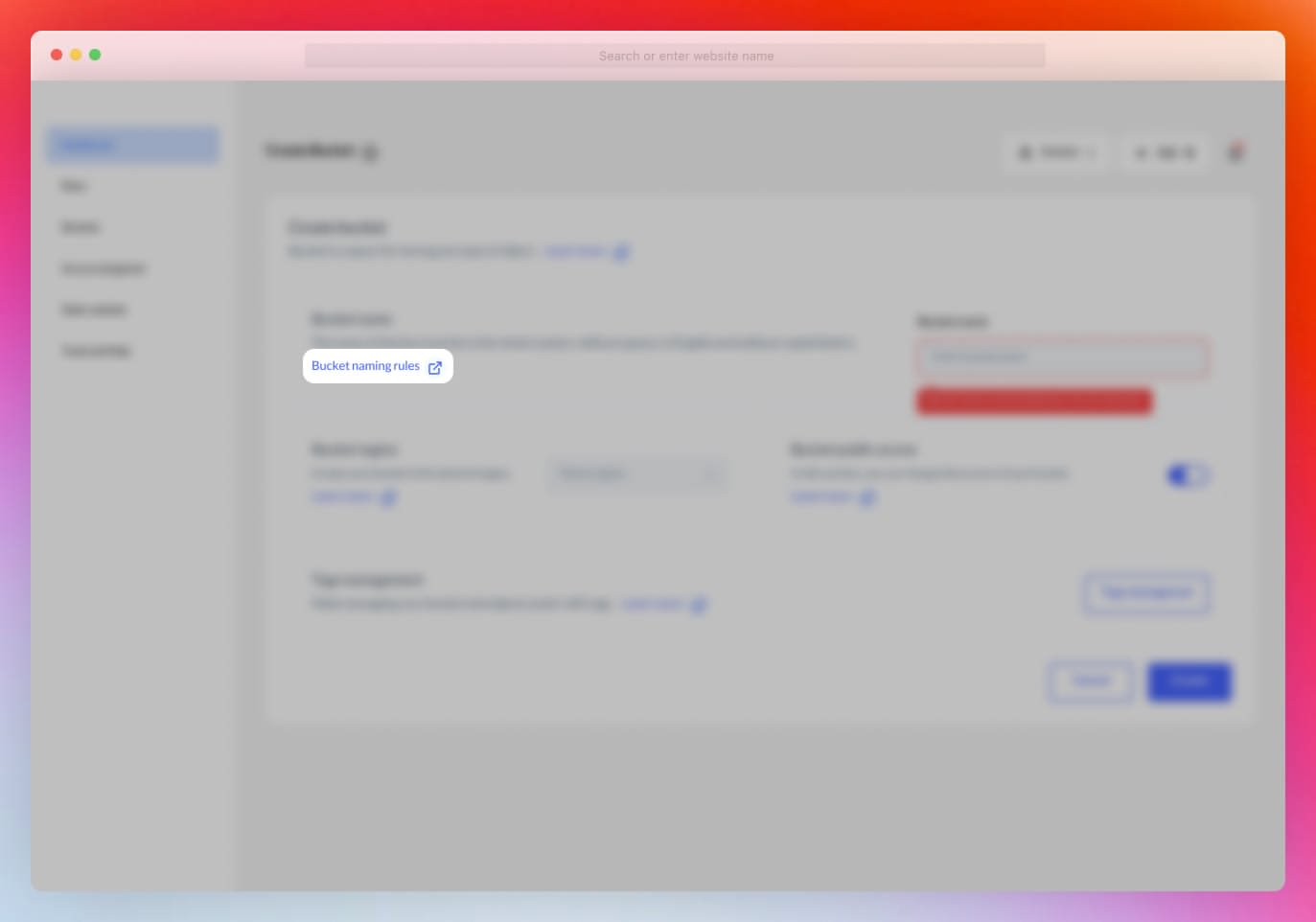

The team also made changes to the text input field to check for naming rule violations before sending requests to the backend. This reduced the number of requests sent to the backend and improved the user experience by providing clear error messages and preventing incorrect bucket names.
Usability testing
Before launching the final product, the team performed usability tests in the staging environment and compared the results to the original version. The metrics used to evaluate the success of the changes included task success rate, user error rate, and bounce rate.
Task success rate
Before
0%After
0%Error rate
Before
0%After
0%Conversion rate
Before
0%After
0%Impact
The changes made to the create bucket page resulted in a 42.84% improvement in user success and reduced errors. The design improvements helped users understand the bucket naming rules, reduced the number of error requests sent to the backend, and made the process of creating a bucket easier and more intuitive.

improvement
42.84%
Conclusion
This case study demonstrates the importance of user-centered design and how even small changes can have a significant impact on the user experience. The team’s efforts to understand the users’ needs and pain points, combined with iterative design and testing, resulted in a successful design improvement project.
