
Introduction
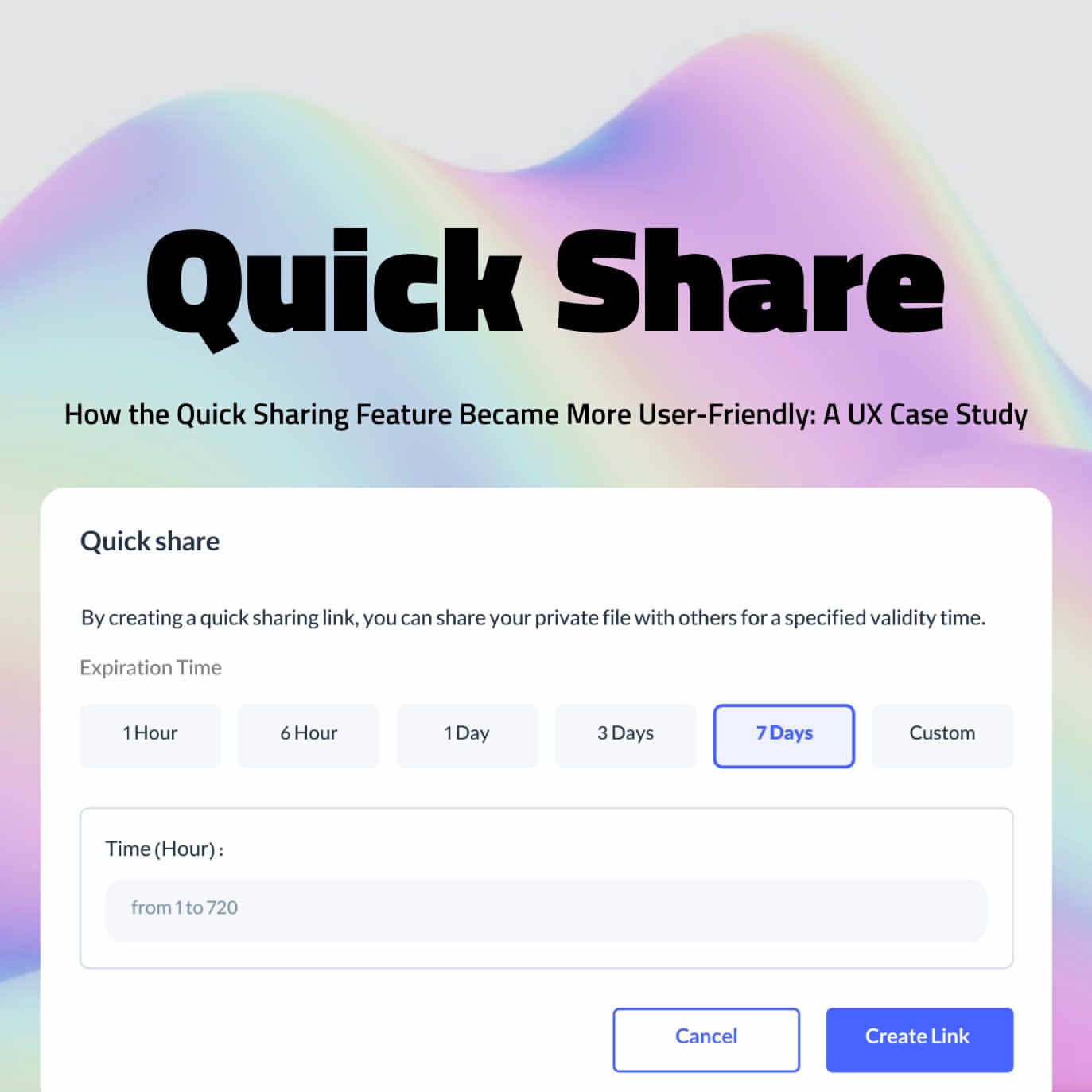
This case study studies the design of the quick sharing feature (creating a download link) in one of the largest cloud providers in Iran, this product has 55 thousand users. At the beginning of the design process, the name of this feature was created download link and in the design process, it was renamed to quick sharing.
Goal of the Quick Sharing Feature
The user can create the download link of the object in the fastest possible time and with the least operations and share it with different people. This feature allows the user to share the download link of the object with others in two different modes, the first mode is when the access to the object is private, in the private mode the user can share the download link of the object as Share the schedule with different people. The second mode is when the access of the object is public, in the public mode, the object will be shared permanently and does not have a limited schedule.
Benchmarking Competitor Products
In the first stage, to review and better understand the feature after preparing the PRD document, we started to review competitors and similar products in this field. As the closest similar products, we examined the following products: AWS, Azure, Google Cloud, Cloudflare, DigitalOcean.


AWS


Azure


Cloudflare


Digitalocean


Google cloud
Design Process: User Flow and Wireframe
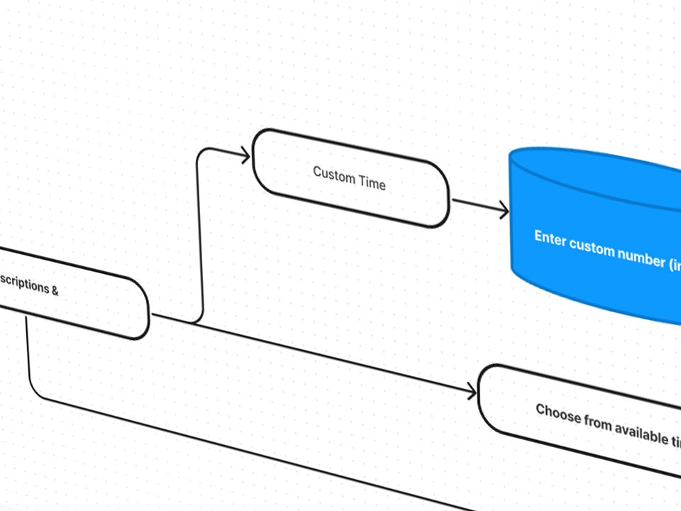
After reviewing the competitors and fully understanding the features, we started to design the user flow on the flowchart. Based on the finalized user flow, we started designing different parts of this feature in wireframe and low fidelity mode.

Usability Testing and Metrics
We prepared the designed wireframes for the small-scale usability test, we had two general tasks in mind for this test: Create a download link for the object and send the link to someone and create a new link for the same object with 20 hours of credit. At the end of each step, we output the test result based on the following KPIs and compared it with the previous steps: Task success rate, Time on Task, User error rate.
Task success rate
Time on Task
Creating a download link
First stage
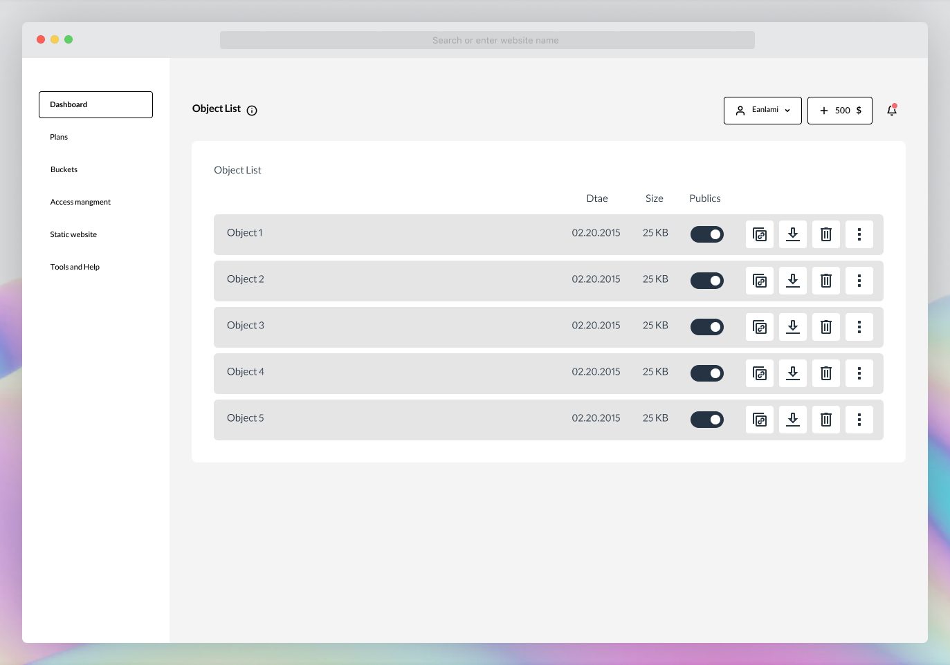

In the design process of the quick sharing feature in a cloud provider, wireframes and low-fidelity prototypes were created to represent the feature’s user flow and interface. However, with the unavailability of real users for testing at this stage, the team decided to conduct a test with internal employees who were users of the product but had limited technical knowledge about it. After completing the test, each participant was interviewed individually to gather feedback and further insights. This approach allowed the team to evaluate the early designs and make any necessary improvements before conducting a full-scale usability test with real users.
Task success rate
0%42 Seconds


Challenges with Finding the Quick Sharing Feature: A User Experience Concern
A significant number of users have reported difficulties in finding the quick sharing feature, which allows them to create download links. Furthermore, the time spent on this task was also a concern. In an effort to improve the user experience, the team conducted a series of tests to assess different icon options for the feature. However, after reviewing the results of the tests and conducting interviews with the participants, it was discovered that the users had trouble understanding the concept behind the icon and struggled to locate the feature.
Enhancing User Accessibility: Moving the Quick Sharing Feature to the Operation Menu
To address these issues, the team came up with a solution to move the quick sharing feature to the operation menu and include a written name for the feature in addition to the icon. This change aimed to make the feature more accessible and intuitive for the users, reducing the time spent on this task and improving overall satisfaction.
Second stage


In the second stage of testing, the team took a step forward in refining the design by creating a high-fidelity prototype. The goal was to validate the changes made in the previous stage and improve the user experience further. The new prototype included the quick sharing feature in the operation menu, with a clear name and icon to represent it.
To assess the impact of the changes, the team conducted another round of testing, asking users to complete the same tasks as in the previous stage. The results were then compared to the previous results to determine the effectiveness of the changes.
By validating the design changes through high-fidelity prototyping and user testing, the team aimed to ensure that the quick sharing feature was easily accessible and intuitive for the users, ultimately leading to an improved user experience.
Task success rate
0%36 Seconds
Persistent User Confusion in Finding Download Link Creation Feature
Despite the initial design changes and improvements, some users were still struggling to find the download link creation feature. The tests showed that users were aware that they needed to go to the operation section to access the feature, but a portion of the test takers were still unable to locate it even after entering the section.
Rebranding the Feature for Better User Awareness
To resolve this issue, the team conducted further design reviews and tests and concluded that a change in the name of the feature was necessary. Instead of “Creating a Download Link,” the feature was renamed to “Quick Sharing” in the operation section to better convey its purpose and make it more noticeable to users. The team believed that this change would lead to a better user experience and improve the success rate of the feature.
Third step
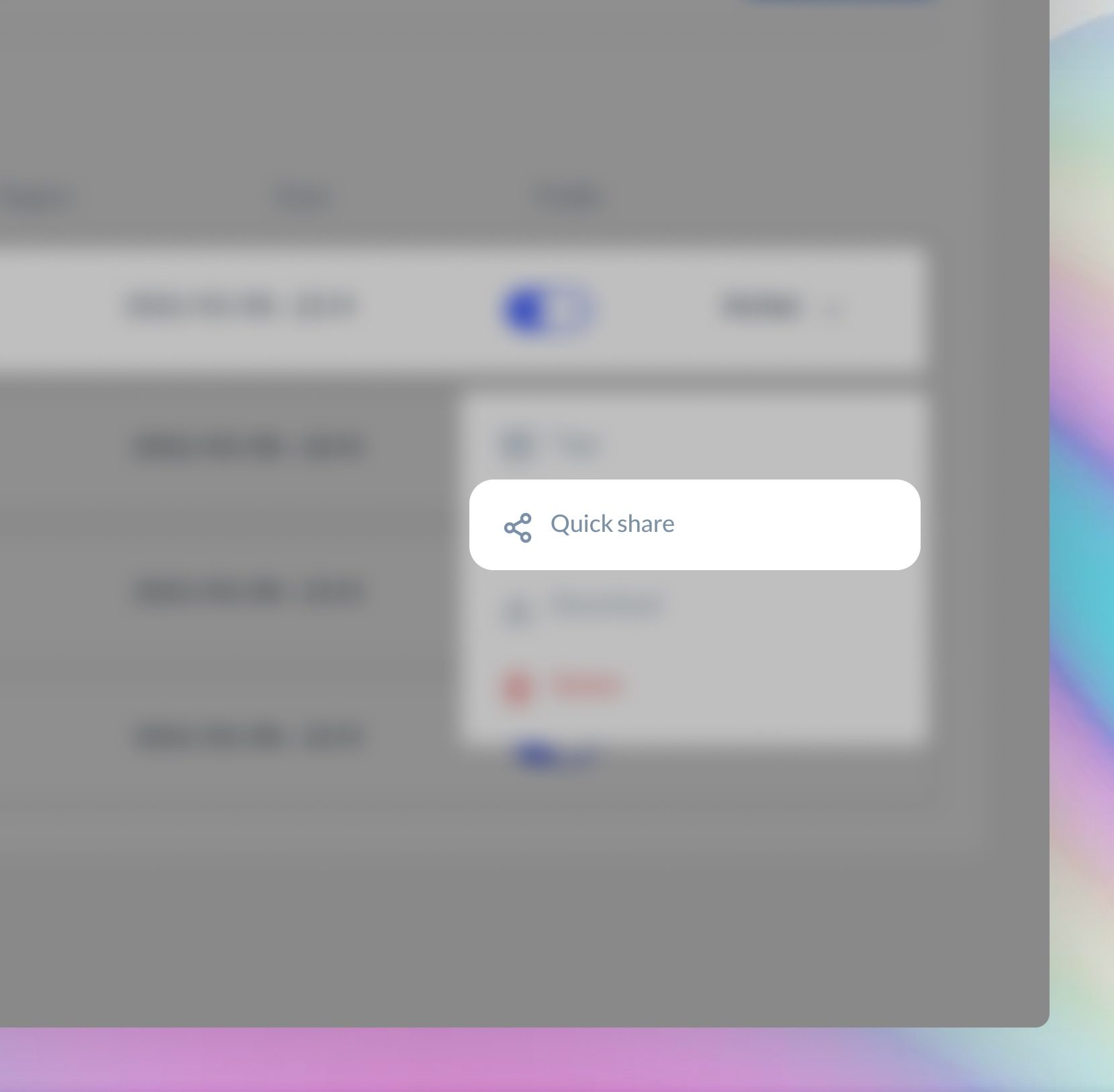

After renaming the download link creation feature to “Quick Sharing,” we conducted the third round of testing and compared the results with the previous stages. The results showed a marked improvement, with all users successfully completing the task. The new name of the feature, “Quick Sharing,” was well received by the testers and made it easier for them to understand its purpose and locate it within the operation section.
Task success rate
0%23 Seconds
Task 2: Create custom time
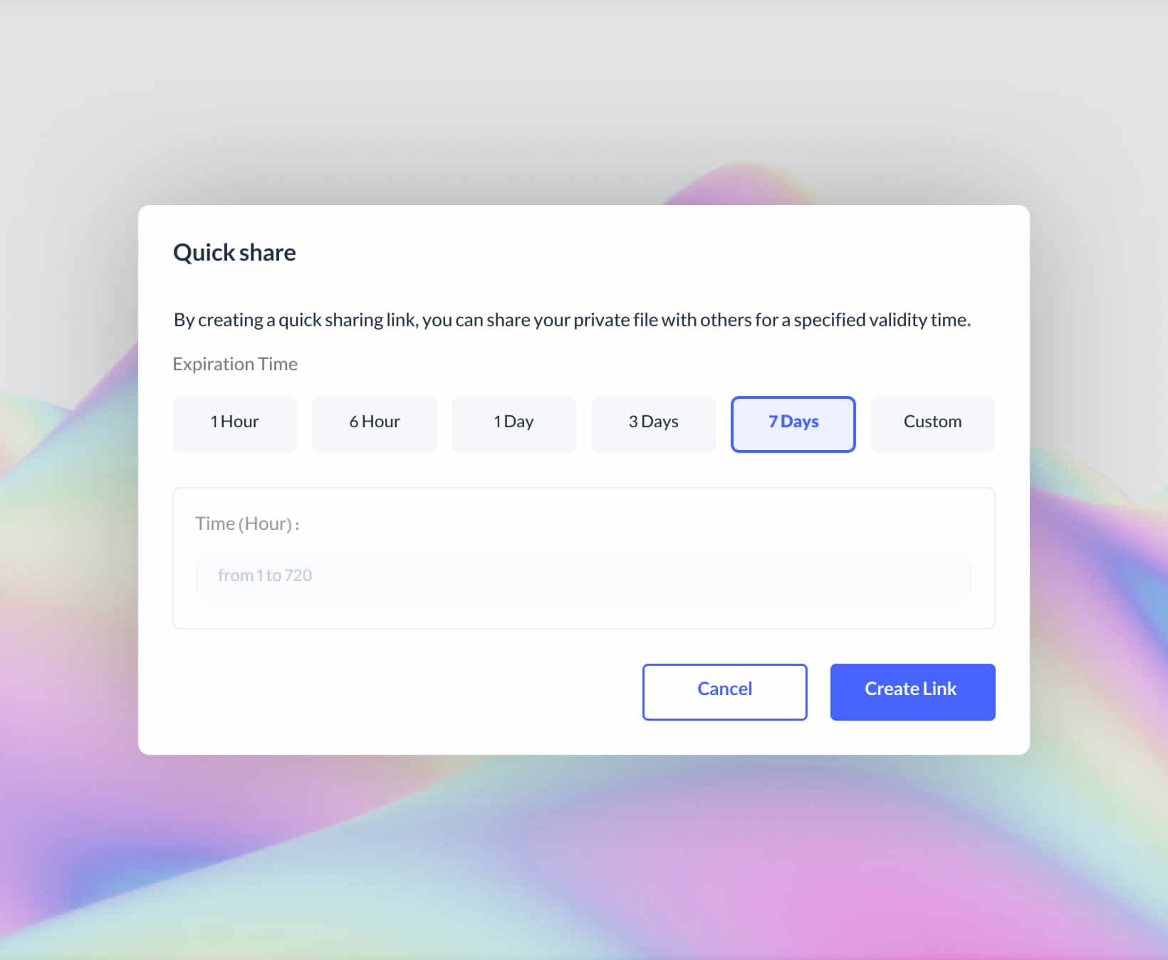

In the second task, we asked the users to create a quick sharing link with a limited access time of 20 hours. This task was separately evaluated, and the results showed the following outcomes:
Task success rate
0%User error rate
0%Problem: Inefficient Understanding of Disabled Text Input
According to the results of user testing, some users were unable to comprehend the purpose of the disabled text input in the expiration time selection section. Despite its activation only when a custom time was selected, the inactive field caused confusion for test subjects.
Solution: Streamlining Custom Time Selection
In response to these findings, the team decided to make changes to the custom time selection section. The new design eliminates the custom time text input, making it active only when the user specifically selects the custom time option. The team conducted a follow-up test to evaluate the efficacy of this change.
Second stage
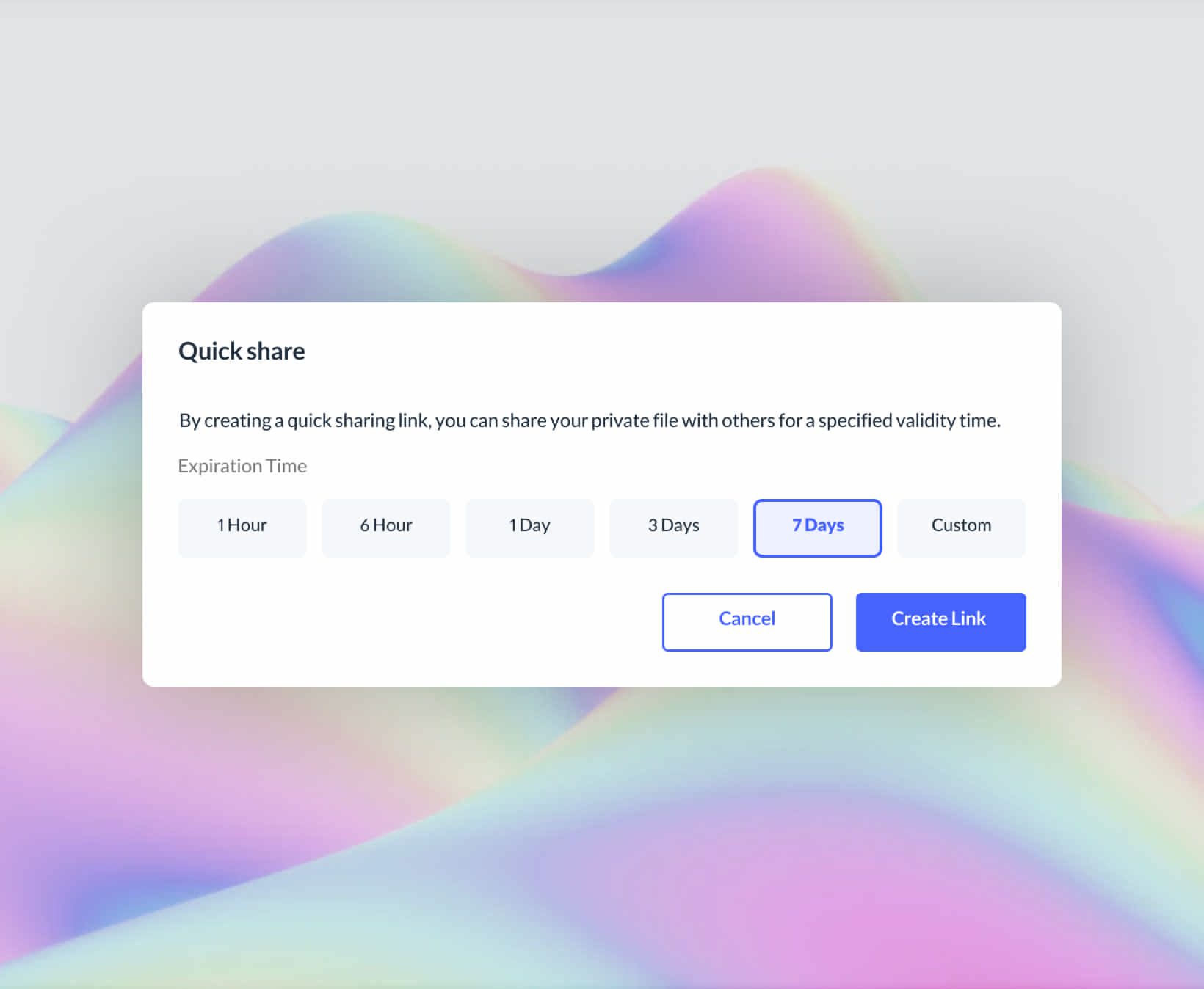

The second task testing revealed an improvement compared to the previous stage. All users were able to successfully complete the task of creating an access link with an expiration time of 20 hours. The changes made to the custom time selection section seemed to have positively impacted user understanding and completion of the task.
Task success rate
0%User error rate
0%Impact
The results of the implementation of the download link creation feature were positive and had a significant impact on user satisfaction. After adding the feature, users made extensive use of it and created download links for their objects with ease, sharing them with others. The company received minimal negative feedback and support tickets, indicating a high level of user satisfaction.
Conclusion
In conclusion, this article discussed the process of testing and improving a download link creation feature. Through multiple stages of testing, the development team found that users were having trouble finding the feature and understanding its functionality. In response to these issues, the team made design changes such as transferring the feature to the operation menu, renaming the feature, and modifying the custom time selection section. As a result of these changes, users were able to successfully pass the relevant tests and use the feature with minimal negative feedback. This article demonstrates the importance of user testing in the product development process and how small design changes can have a significant impact on user experience.
